Graphic design wields immense power in conveying messages, capturing attention, and enhancing brand identity. However, even skilled designers can inadvertently make mistakes that hinder the effectiveness of their designs. In this blog post, we will delve into the most common graphic design mistakes and provide detailed insights on how to avoid them. By understanding and addressing these pitfalls, designers can create designs that not only visually stun but also resonate with their target audience.

Poor Typography Choices
Typography plays a fundamental role in design, significantly impacting readability and overall effectiveness. Making inappropriate or illegible font choices can considerably diminish the design’s message and visual appeal. Carefully selecting fonts that align with the message and brand identity is essential. Ensure clarity, legibility, and coherence by considering factors such as font style, size, spacing, and readability across different mediums and devices. This ensures that typography enhances the design rather than detracts from it.
Overcrowded Layouts
Overcrowded designs overwhelm viewers, making it difficult for them to focus on the main message. When numerous elements compete for attention, the design loses its visual impact and becomes visually cluttered. Achieving a balanced and harmonious layout involves embracing white space, also known as negative space. By strategically incorporating white space, the design elements can breathe, creating a sense of visual hierarchy and directing the viewer’s attention to the essential elements. Carefully consider the placement, spacing, and arrangement of elements to create a visually pleasing and impactful design.
Lack of Hierarchy
Visual hierarchy organizes and arranges design elements to guide the viewer’s attention and convey information in a structured manner. Designs without a clear visual hierarchy appear cluttered, confusing, and overwhelming. Establishing a strong hierarchy helps viewers navigate the design more easily, understand the information hierarchy, and prioritize the most important elements. Use contrast in size, color, and font weight to differentiate between headings, subheadings, body text, and other design elements. Creating a clear visual path makes the design more coherent and engaging.
Inconsistent Branding
Consistency in branding is vital for maintaining a strong and recognizable brand identity. Failing to adhere to established brand guidelines dilutes brand identity and creates confusion among the audience. Consistently apply the brand’s colors, typography, logos, and other visual elements across different design materials to ensure a cohesive and unified brand image. This reinforcement of brand recognition builds trust with the audience.
Improper Color Usage
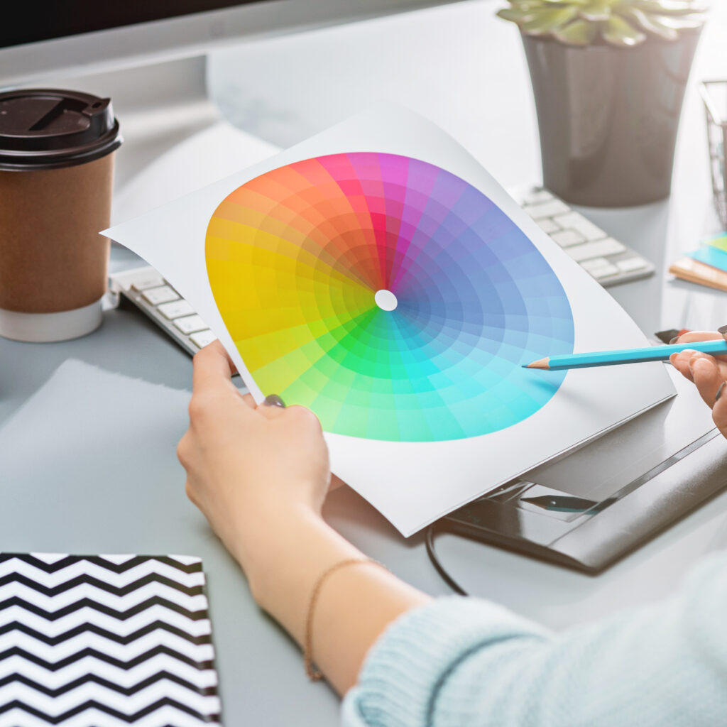
Colors wield a powerful influence on emotions, perception, and communication in design. Selecting inappropriate colors or using too many colors can result in visual chaos or unintended emotional responses. Understand color theory and choose colors that align with the message, target audience, and brand personality. Consider color psychology, color combinations, and the desired emotional impact when selecting colors for a design. Using a limited color palette and harmonizing colors effectively can create a visually pleasing and impactful design.
Lack of Contrast
Insufficient contrast between text and background compromises readability, particularly for individuals with visual impairments. Ensure adequate contrast to guarantee legibility and make information easily accessible to all viewers. Consider the color contrast between text and background to ensure optimal readability. Achieve high contrast by selecting colors with distinct brightness or hue differences, using dark text on a light background or vice versa, and avoiding color combinations that reduce contrast. Enhancing contrast makes the design more inclusive and user-friendly.
Ignoring Alignment
Proper alignment is a key design principle that creates a sense of professionalism, cohesiveness, and orderliness. Neglecting alignment results in an unprofessional and disjointed appearance, making the design visually unappealing and difficult to comprehend. Align elements consistently along a grid or use visual guides to create a harmonious and organized layout. Pay attention to aligning text, images, and other design elements to create a sense of balance and visual unity.
Low-resolution Images
Using low-resolution or pixelated images significantly diminishes the quality and professionalism of a design. Blurry or pixelated visuals not only detract from the overall aesthetics but also convey a lack of attention to detail. Opt for high-resolution images to ensure visuals are sharp, clear, and visually appealing. When using images, always choose high-quality and properly sized images that maintain their integrity and enhance the overall visual impact of the graphic design.
Inappropriate Image Scaling
Improperly scaling images distorts their proportions and compromises the overall aesthetic of a design. When resizing images, maintain their aspect ratio to ensure they are not stretched or squished. By preserving the original proportions, the images retain their intended visual impact and fit harmoniously within the design. Use image editing software or design tools to resize images accurately while maintaining their quality and integrity.
Excessive Use of Effects
Graphic Design effects, such as gradients, drop shadows, or glows, can enhance the visual appeal when used appropriately. However, overusing these effects can make the design look dated, distract from the intended message, and create a visually overwhelming experience. Use effects sparingly and purposefully to enhance the design without overpowering it. Consider the design’s overall style, purpose, and target audience when incorporating effects to ensure they contribute to the design’s visual impact and support the intended message.
Lack of White Space
Insufficient white space can make a design feel crowded, overwhelming, and visually unbalanced. White space refers to the empty or unmarked areas in a design, which help create breathing room and separation between elements. Embrace white space strategically to allow design elements to stand out, enhance readability, and bring focus to the key elements. Use white space to provide visual clarity, create a sense of elegance, and ensure the design feels spacious and well-organized.
Inconsistent Line Heights
Inconsistently spaced lines of text disrupt readability and the visual flow of a design. Maintain consistent line heights, also known as leading or line spacing, to create a smooth reading experience and improve the overall aesthetics. Proper line spacing allows the text to breathe, makes it easier for the reader to follow along, and enhances the overall visual appeal of the design. Pay attention to the line spacing and ensure it is consistent and appropriate for the font size and style used.
Inadequate Proofreading
Typos, grammatical errors, or incorrect information undermine the professionalism and credibility of a design. Thoroughly proofread all text content to ensure accuracy, clarity, and avoid embarrassing mistakes. Take the time to review and edit the design’s text content, paying attention to spelling, grammar, punctuation, and factual correctness. Additionally, consider seeking a second pair of eyes to proofread the design to catch any errors that may have been overlooked.
Misusing Stock Graphics
Using generic or overused stock graphics can make a design appear cliché, unoriginal, and lacking uniqueness. To create visually distinctive designs, select unique and relevant visuals that align with the message and brand identity. Consider customizing stock graphics or using original illustrations, icons, or photographs that help convey the intended message and create a visual identity specific to the design.
Ignoring Mobile Optimization
With the increasing use of mobile devices, optimizing designs for different screen sizes and platforms is crucial. Ignoring mobile optimization results in designs that appear distorted, unresponsive, or fail to provide a seamless user experience. Test the design on various devices, including smartphones and tablets, and across different platforms to ensure its responsiveness, readability, and visual appeal. Adapt the design layout, font sizes, and interactive elements to provide an optimal user experience across different devices.
Overcomplicating the Design
Complex designs with an excessive number of elements can confuse the viewer and dilute the intended message. While it’s important to create visually engaging designs, strive for simplicity and minimalism to achieve more impactful and easily understood designs. Simplify the design by removing unnecessary elements, focusing on the core message, and ensuring that each design element serves a specific purpose. By simplifying the design, the main message becomes more prominent, and the overall visual impact is heightened.
Lack of Focus
Designs without a clear focal point leave the viewer unsure of where to direct their attention. Establish a strong focal point that anchors the design, guiding the viewer’s gaze and ensuring a clear message. This can be achieved through the use of contrasting colors, bold typography, or strategically placed visual elements. By creating a clear focal point, the graphic design becomes more engaging and memorable.
Ignoring User Experience
Designs should prioritize the user experience to ensure ease of navigation, interaction, and overall satisfaction. Failing to consider the user experience results in designs that are frustrating to use and fail to achieve their intended goals. Conduct usability testing, gather user feedback, and iterate on the graphic design to create intuitive, user-friendly, and enjoyable experiences. Consider factors such as intuitive navigation, clear calls to action, and efficient user interactions when designing for optimal user experience.
Conclusion
Avoiding these common graphic design mistakes is crucial for creating visually compelling and effective designs. Pay attention to typography, layout, color, branding, and user experience. By understanding and sidestepping these pitfalls, designers can elevate their skills and produce designs that truly make an impact. Embrace these insights, apply them to your design process, and create visually stunning works of art that leave a lasting impression on your audience.